There are many options for which units to use to define the size of various CSS properties. But I found myself using just about 20% of them in 80% of the cases. No reference to the Pareto principle 🙂
I think the ones that I use the most are:
- unit based: pixels(
px), percentage (%) and viewport units (vwandvh) - based on font-size:
remandem; more about them here - flexbox and css grid specific:
fr
Comparing pixels vs percentage vs viewport units
Let's take the following example:
- the first element has a fixed width of 75pixles
- the second is set to a relative width of 50% from the available space of the parent
- and the third one has a width of 100vh, meaning it will be 100% of the viewport width
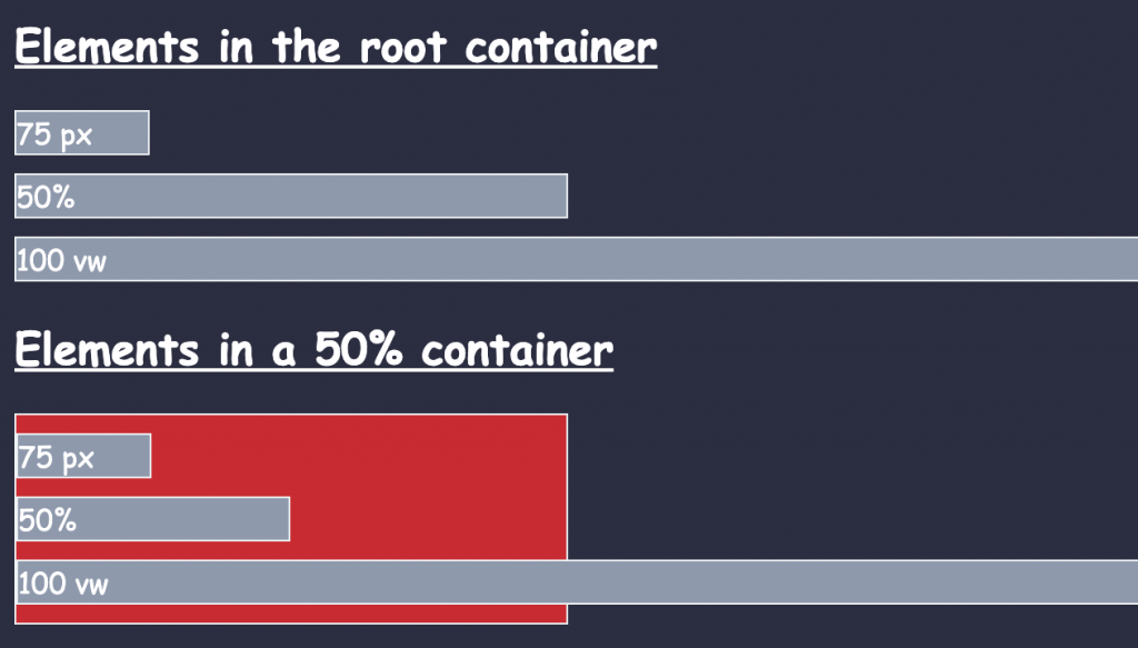
The differences are becoming clear when we move the same elements in a container that is also set to be at 50% from the width of the body. See the red container.
While the first element will keep it's fixed width of 75px the second one will adapt its width based on the width of the container. Now, given the fact that the width of the container is half the width of the body, the second element will end up with a width of 25% from the body (50% from 50%).
However, even it the last element with a width of 100vh (viewport width) may be interpreted as relative - 100% of something - that something is the viewport width meaning that it will not matter how long the container is. It will take into account just the width of the full screen.
By the way, regarding the viewport size, we also have the vh - viewport hight as a complementary dimension. Even though the vh is usually used to define the height of elements, we can also make some funny associations like:
.my-element {
    width: 50vh;
}
/* can be used to make some aspect ratio tricks */
What are the vmin and vmax units
Speaking of the viewport units:
- with
vmin, we size as a percentage of the smallest between the width or the height of the viewport - and with
vmax, we size as a percentage of the largest between the two.
So, for example, that our viewport is 800px wide and 600px tall, if we set element to have a width of 50vmin, it’ll be 50% of the height (300px).
The vmax will select the bigest value btweeen the width and the height of the screen.
Below is the full codepen for this example. Stay tuned, as in the next article we will see the difference between using the em and rem units.
📖 50 Javascript, React and NextJs Projects
Learn by doing with this FREE ebook! Not sure what to build? Dive in with 50 projects with project briefs and wireframes! Choose from 8 project categories and get started right away.
📖 50 Javascript, React and NextJs Projects
Learn by doing with this FREE ebook! Not sure what to build? Dive in with 50 projects with project briefs and wireframes! Choose from 8 project categories and get started right away.