You may have used CSS Flexbox before and found your flex items or images stretching to the full height or width of the container.
Let's take the below HTML code:
<div class="container-flex">
    <div>Lorem ipsum ... </div>
    <img src="tom-jerry.jpeg" />
</div>
We will run into the below problem as the aspect ratio of the the image will break:
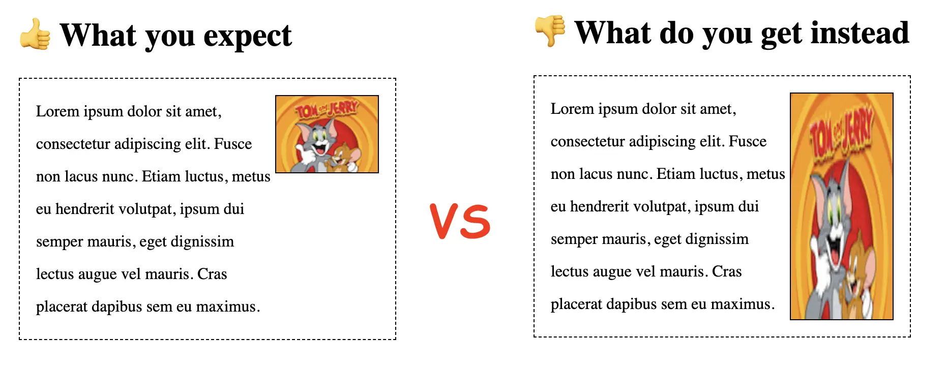
Let's first take a look at why this happens.
Why do flex items stretch ?
The reason why the flex images are stretching is because the property align-items acts by default as it has the its value set tostretch.
By default, we have align-items: normal. Just that if the layout mode is static, meaning the default position for HTML elements (eq is not absolutely positioned) , the normal value is the same as stretch.
align-items: stretch;More info about align-items property here.
Any other types of items elements will strech, not just images. And it will be the same if we set the flex-direction: column.
Solutions to prevent the stretch in flexbox
In order to prevent the unwanted stretching of the elements we can:
- update the
align-itemsvalue on the flex container - set the
align-selfproperty to the actual child element or image
For our particular case we can have:
<div  style="align-items: flex-start" class="container-flex">
    <div>Lorem ipsum ... </div>
    <img src="tom-jerry.jpeg" />
</div>
Or:
<div class="container-flex">
    <div>Lorem ipsum ... </div>
    <img style="align-self: flex-start;" src="tom-jerry.jpeg" />
</div>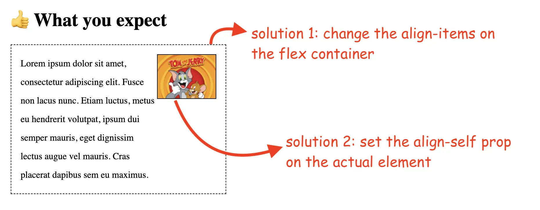
You can see the full code here and the live example on GitHub pages.
📖 50 Javascript, React and NextJs Projects
Learn by doing with this FREE ebook! Not sure what to build? Dive in with 50 projects with project briefs and wireframes! Choose from 8 project categories and get started right away.
📖 50 Javascript, React and NextJs Projects
Learn by doing with this FREE ebook! Not sure what to build? Dive in with 50 projects with project briefs and wireframes! Choose from 8 project categories and get started right away.