Placing elements on top of each other in CSS Grid it's quite easy. Let's see how we can do this.
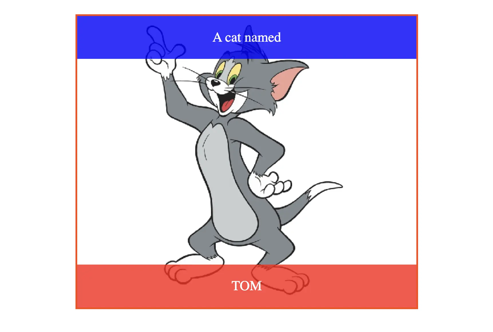
For this example we want to stack the red and blue elements on top of an image:
CSS grid can stack elements right out of the box. The way we can do this is by:
- stretching the image on the full surface of the grid container
- and manually place the items on top of the image.
This is the CSS that will stack the elements in the grid:
.container {
display: grid;
}
img {
grid-area: 1 / 1 / 4 / 2;
}
.blue {
background-color: blue;
grid-area: 1 / 1 / 2 / 2;
}
.red {
background-color: red;
grid-area: 3 / 1 / 4 / 2;
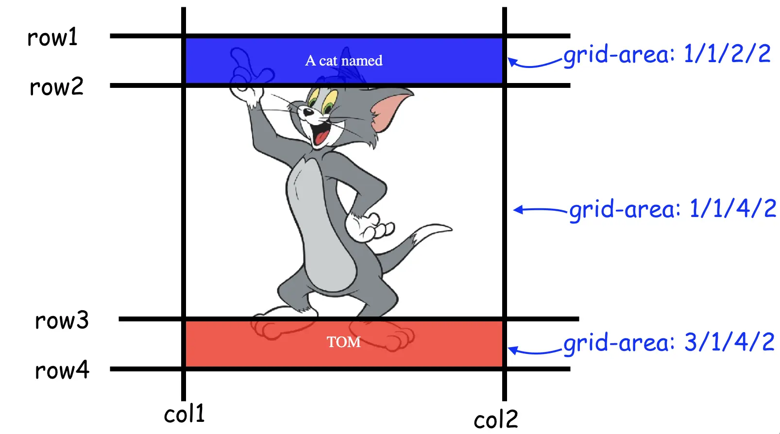
}Even if we have not manually defined the number of rows and columns of the grid container, the structure will be made based on the maximum values. In our case this is what we have placed on the image element:
img { grid-area: 1 / 1 / 4 / 2;  }
/* 👆 a grid that starts at line row  1 , column 1,
and ends at line row 1, column 1 */
Remember that the CSS grid uses line numbers to place items. So, our layout will look like so:
This is how easy it is to stack elements on top of each other using a CSS Grid. A good practice here is to add an extra z-index for stacking contexts:
.blue,
.red {
    /*👇 not mandatory but can prevent bugs */
    z-index: 2;
}
You can find the full code on my GitHub and see the running live example here.
📖 50 Javascript, React and NextJs Projects
Learn by doing with this FREE ebook! Not sure what to build? Dive in with 50 projects with project briefs and wireframes! Choose from 8 project categories and get started right away.
📖 50 Javascript, React and NextJs Projects
Learn by doing with this FREE ebook! Not sure what to build? Dive in with 50 projects with project briefs and wireframes! Choose from 8 project categories and get started right away.