We can use the accent-color CSS to easily style form elements. The currently supported elements are radio buttons, checkboxes, and range input types.
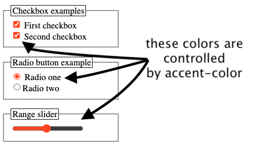
For example, if we apply this CSS rule:
input {
  accent-color: orangered;
}
We will get the below output.
Until the introduction of the accent color, we needed to do CSS tricks like this one to style elements such as checkboxes.
Automatic accessibility build in the accent-color property
We have some accessibility features built in the way of how accent-color works. For example, if we change the accent color the color of the checkmark will be auto-updated to get a better contrast.
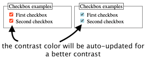
For the moment I did not find any way to set the actual contrast color for items such as the check mark.
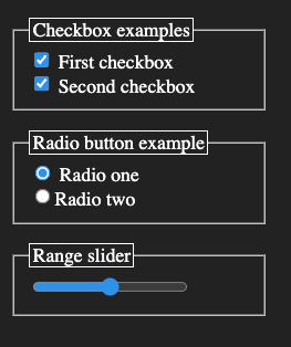
Using accent-color with CSS variables and color schemes
One cool thing we can do is to mix up the accent-color with a :root CSS variable.
:root {
  --ac: orangered;
}

input {
  accent-color: var(--ac);
}
And when we switch to a different color scheme we can just redefine the CSS variable for better contrast.
@media (prefers-color-scheme: dark) {
    :root {
        --ac: #4692ec;
    }
}
You can check out there the full codepen for this example.
📖 50 Javascript, React and NextJs Projects
Learn by doing with this FREE ebook! Not sure what to build? Dive in with 50 projects with project briefs and wireframes! Choose from 8 project categories and get started right away.
📖 50 Javascript, React and NextJs Projects
Learn by doing with this FREE ebook! Not sure what to build? Dive in with 50 projects with project briefs and wireframes! Choose from 8 project categories and get started right away.