The scope of this article is to build a NextJs sample app with a layout that contains a responsive sidebar.
We can use it as a starting example for future projects. The final example is shown in the video below:
Let's see how we can do this.
Setting up the NextJs static pages
Our app will only have 3 static pages in the app folder:
- home page
- news page
- and the contact page
Therefore we will start with a simple structure as this:
/app
    /contact
        page.js
    /news
        page.js
    page.js
And each page.js file will just return a header similar to this one:
export default function Page() {
    return <>
      <h1>Contact Page</h1>
    </>
}
Adding a static sidebar to the NextJs layout
The perfect place to put a common sidebar is the main layout page.
We will start by adding some styles to a new utils.module.css folder.
/* app/utils.module.css */
.sidebar {
    margin: 0;
    padding: 0;
    width: 200px;
    background-color: #f1f1f1;
    position: fixed;
    height: 100%;
    overflow: auto;
    border: 2px solid black;
}

.sidebar a {
    display: block;
    color: black;
    padding: 16px;
    text-decoration: none;
}

.sidebar a:hover:not(.active) {
    background-color: #555;
    color: white;
}

.content {
    margin-left: 200px;
    padding: 1px 16px;
    height: 1000px;
}
And after we can import and use the styles in the layout file.
import styles from "./utils.module.css";
import Link from "next/link"
export default function RootLayout({ children }) {
return (
<html>
<head />
<body>
<div className={`${styles.sidebar}`}>
<Link href="/">Home</Link>
<Link href="/news">News</Link>
<Link href="/contact">Contact</Link>
</div>
<div className={`${styles.content}`}>
{children}
</div>
</body>
</html>
)
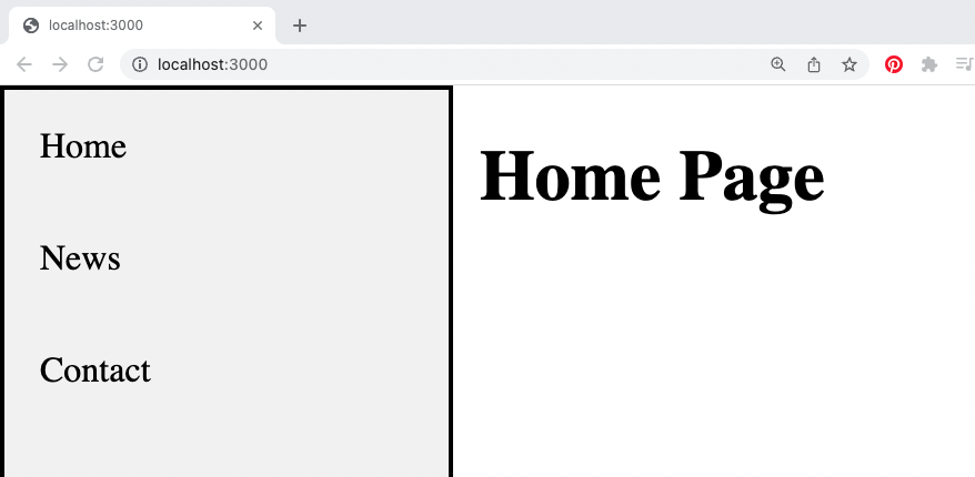
}At this point our app will look like this:
If you want to make your app look better here is also the perfect place to use some React icons or add page transitions using templates to your NextJs pages.
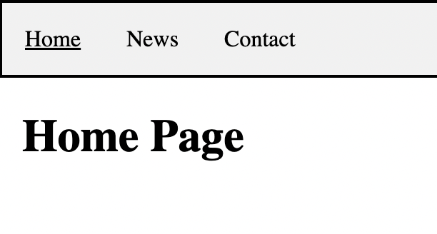
Highlighting the active page in the NextJs sidebar navigation
This step is optional. One more thing we can do is highlight the currently active link in the navigation. Wrote a full tutorial about this here.
Keep in mind that to be able to use the useSelectedLayoutSegment() in the layout, we will need to mark it as a client component:
'use client';

import styles from "./utils.module.css";
import Link from "next/link"
import { useSelectedLayoutSegment } from 'next/navigation'

export default function RootLayout({ children }) {
  const activeSegment = useSelectedLayoutSegment()

  const links = [
    {label: ' Home', path: '/', targetSegment: null},
    {label: ' News', path: '/news', targetSegment: 'news'},
    {label: ' Contact', path: '/contact', targetSegment: 'contact'}
  ];
  return (
    <html>
      <head />
      <body>
        <div className={`${styles.sidebar}`}>
        {links.map ( (l, i) => {
            return <Link
                  key={i}
                  href={l.path}
                  style={{textDecoration: (activeSegment === l.targetSegment) ? 'underline' : 'none'}}>
                {l.label}
            </Link>
        })}
        </div>
        <div className={`${styles.content}`}>
          {children}
        </div>
      </body>
    </html>
  )
}
Making the NextJs sidebar responsive
We can use CSS media queries to make the NextJs sidebar responsive.
Therefore open the utils.module.css file and add this part to it:
/* app/utils.module.css */

/* the rest of the styles here */

@media screen and (max-width: 500px) {
    .sidebar {
        width: 100%;
        height: auto;
        position: relative;
    }
    .sidebar{
        display:flex;
    }
    .content {
        margin-left: 0;
    }
}

@media screen and (max-width: 300px) {
    .sidebar{
        display:flex;
        flex-direction:column;
        text-align:center;
    }
}
And this concludes our small example. You can check out the full code example here.
📖 50 Javascript, React and NextJs Projects
Learn by doing with this FREE ebook! Not sure what to build? Dive in with 50 projects with project briefs and wireframes! Choose from 8 project categories and get started right away.
📖 50 Javascript, React and NextJs Projects
Learn by doing with this FREE ebook! Not sure what to build? Dive in with 50 projects with project briefs and wireframes! Choose from 8 project categories and get started right away.